Respond.Responsive Design 101
What is "responsive"?
Responsive is not "squishy".
This would imply that a responsive website is simply a site designed for a desktop browser, then shrunk down and rearranged to fit on smaller screens. That is the exact opposite of how we design and develop responsive pages.
Responsive is "fluid".
Developers start with one set of content, then style it in such a way that it flows naturally to fill different screen sizes. Additional styles are added on to direct the flow of content as the room to display it increases with screen size.
Responsive websites respond to the viewing environment when presenting content to the user.
- Screen size
- Hardware
- Network connection speeds
- Browser capabilities
Progressive Enhancement
This content-focused design and development strategy defines the base site user experience as all content being accessible on the lowest common denominator of browser. Additional styles, images, and scripts are treated as additional features that are nice but not necessary to deliver site content to the end user.
Mobile First
An application of the progressive enhancement strategy that starts with design and development of the mobile web experience. The content structure, design, and functionality of site as it appears on smartphones is treated as the base experience, and the elements that can expand into the extra space on desktop browsers are treated as an enhancement of that base. An important question to ask when adopting the mobile first content organization strategy is: What content is most important for users to see first in a limited screen space?
Everyone's Different
And that's okay. The look of your site may vary when viewed on different browsers and devices, as each renders site structure, styles, and functionality according to its specific feature support. If a site is designed with progressive enhancement in mind, then users will be able to view all content regardless of what means they are using to access the site - even if all styles do not render pixel-perfectly.
For more information, visit dowebsitesneedtolookexactlythesameineverybrowser.com.
Expect (and embrace) the Unexpected
When viewing a page across different environments, it is common to notice some inconsistencies in:
- Font size & typeface
- Colors
- Page accents (borders, etc.)
While it may be tempting to address (read: hack) certain design issues on certain browsers, doing so runs the risk of having a negative impact on the user experience. We have to embrace these imperfections rather than fight against them.
Screens do not fold (yet).

Do not worry about trying to fit as much content as possible "above the fold," because your users will not be folding their screens. They will, however, be re-sizing and re-orienting them, and sending links from screens of one size to those of another. Focus on spacing content so that it is legible and accessible regardless of screen size, and flows smoothly from one size to another.
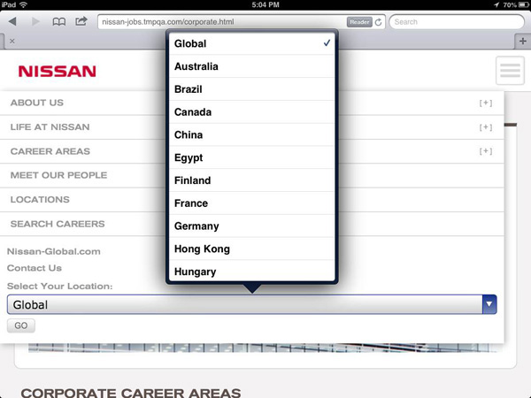
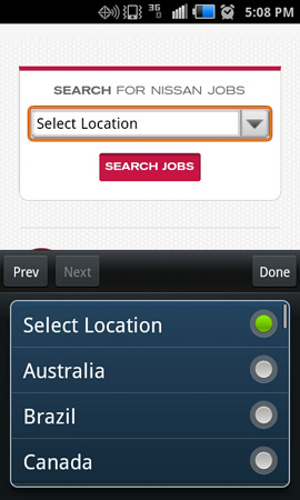
Declare Device Independence


In today's market, there are hundreds of mobile devices of every shape and size, with new ones signing online every day. Given the diversity of available devices, there is no one set breakpoint for "tablet" or "smartphone". The 6.3" display on the Samsung Galaxy Mega is much closer in size to the 7.9" display of the iPad Mini than it is to the 4" display of the iPhone 5, yet the Mega is marketed as a smartphone.
If you try to target designs to only one or two specific devices ("as long as it looks good on my iPad"), you may find that your design "breaks" on other devices, which may alienate a significant portion of your user base. The best mobile experiences are designed around fluid content that will flow cleanly into whatever screen users want it to fill.
Orderly Conduct
The elements in responsive sites seem to be very fluid, as they shift position and size in accordance with the dimensions of the screen on which they are displayed. However, the order in which elements appear on the site (reading the web page from top to bottom like the page of a book - you remember books, right?) is relatively fixed.
While it may be easy in the design phase of a site to shift layer order or reposition elements on the page as its overall dimenstions change, elements cannot be moved and re-positioned as simply once they are marked up in HTML as part of the page element structure. Developers see sites as a list (or "tree") of objects with a set order, not a free-floating collection of layers.
To keep user experiences consistent across multiple platforms, be sure that your designs do not switch around the order of major site elements as they move from one screen size to another.
Mobile site
Lorem ipsum dolor sit amet, consectetur adipiscing elit. Mauris sagittis nulla a eros sollicitudin adipiscing. Phasellus eget sodales tortor.
Curabitur a rhoncus leo. Sed aliquam nisl at nisi facilisis egestas. Aenean vitae tellus a neque luctus suscipit in a mauris. Morbi varius adipiscing urna, et pharetra sapien placerat sed. In hac habitasse platea dictumst. Maecenas hendrerit blandit consectetur.
Vestibulum viverra diam quis dui commodo ut sollicitudin ante porta. Donec arcu mi, aliquet eu egestas a, fermentum viverra ipsum. Phasellus non est purus, in facilisis quam. Phasellus justo neque, lacinia a fermentum vitae, suscipit sed eros.
Desktop site
Lorem ipsum dolor sit amet, consectetur adipiscing elit. Mauris sagittis nulla a eros sollicitudin adipiscing. Phasellus eget sodales tortor.
Curabitur a rhoncus leo. Sed aliquam nisl at nisi facilisis egestas. Aenean vitae tellus a neque luctus suscipit in a mauris. Morbi varius adipiscing urna, et pharetra sapien placerat sed. In hac habitasse platea dictumst. Maecenas hendrerit blandit consectetur.
Vestibulum viverra diam quis dui commodo ut sollicitudin ante porta. Donec arcu mi, aliquet eu egestas a, fermentum viverra ipsum. Phasellus non est purus, in facilisis quam. Phasellus justo neque, lacinia a fermentum vitae, suscipit sed eros.
x
Out of Control
Responsive sites do not get their name because they are responding to the browser viewport size alone. They also must be able to handle changing content (as information is added or removed from the site over time) as well as browser settings on the user end that may alter the manner in which the page renders.
Regardless of how much time and effort designers and developers spend pushing pixels, the user has the ultimate control over the appearance of a website in his or her browser.

Avoid frustration in advance by relinquishing total control over page layout. Keep the content portions of designs flexible enough to be able to accomodate the digital curveballs that might be thrown your way, including:
- Addition/removal of content
- Font size increased in user browser settings (up to 200% larger, for testing to meet WCAG 2.0 Level AA standards)
- User disabling images, CSS, or Javascript
- Accessing site content using an alternative browsing technology, such as a screen reader.
Worth 1,000 Words(?)
Images can carry a lot of meaning, and also a lot of page weight. On mobile browsers, users are paying their carrier for every byte of data that they download. Make those bytes count by eliminating superflous images and providing scaled-down versions of larger desktop-sized banner background images for use in mobile styles.
This does not mean that you should not use images at all in a site - just that the creative elements you incorporate into a design should be relevant to the page content and provide some form of enhancement to the overall site experience.
One important formula to remember throughout all stages of site development is: faster websites = better user experiences. This holds true for both desktop and mobile browsing.


Fat Fingers
When sizing links, form fields, and other elements with which the user will interact, keep the size of the user input device in mind. Screen size, relative link/button size, and other properties of the output (the site as it appears on the mobile or desktop device) need to be considered in relation to the size of what the user will be using to hit those targets.
A mouse pointer can easily pick out one link out of a tiny list, but it is next-to-impossible for a finger to interact with small links with the same precision. Save your users (of all shapes and sizes) frustration and encourage them to interact further with the site by providing easy-to-tap targets.


In Browser We Trust
Most mobile and desktop browsers have plenty of baked-in functionality to handle the user interface for form fields. While every browser handles the inputs a little differently, most users are accustomed to interacting with these default form field styles. Save yourself (and your users) some hassle by avoiding custom form field styles.
Web Harmony
Building a great web presence means striking the right balance between content, design, and functionality. If you are not sure about the impact your design may have on the user experience, just ask one of your friendly neighborhood developers!
Responsive design isn't just about fluid page designs. The responsive process also relies on fluid workflow and frequent collaboration between all team members - including project management, creative, and development. More frequent but shorter check-in meetings can speed up the overall design/development process significantly.
The graphic below shows the ideal responsive, collaborative workflow. While the timeline constraint for a given project may not allow for this much interaction, creative and development should try to collaborate as much as possible to achieve web harmony and develop the best user experiences possible.


To the Internet!
Looking for examples? Take a look at these responsive sites:
But wait, there's more! Check out these responsive design resources:
Still have questions? Send a signal to the UI Super Friends at rwd@tmp.com.
Contributors
- Stephanie Plumeri
- stephanie.plumeri@tmp.com
- @s_plum
- Michael Spellacy
- michael.spellacy@tmp.com
- @Spellacy